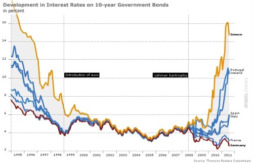
Ezra Klein surveyed 18 economists for their charts of the year. Here’s my candidate, courtesy of Spiegel Online:
This chart illustrates the end of euro complacency. Investors once acted as though the euro eliminated not just currency risk but sovereign credit risk. All nations–from Greece to Germany–could borrow at the same low rates. No longer. As the financial crisis enters its fifth year, markets are again distinguishing between strong nations and weak.
I subsequently discovered that I am not alone in choosing this chart. The BBC has a version of this as the first entry in its survey of top graphs of the year (with commentary by Vicky Pryce of FTI Consulting), and Desmond Lachman of the American Enterprise Institute included it in Derek Thompson’s survey of top graphs over at the Atlantic.
Judging by all the ads I saw on my commute this morning, Capital One has rolled out a new marketing campaign. At least half-a-dozen ads on my Metro car announced that Capital One offers interest rates that are five times higher than offered by their competitors:
And what is that 5x interest rate? Just one percent.
Such are times–and bank marketing–when short-term rates are almost zero.
Here are five things you should know about the downgrade — four important, one trivia.
1. S&P downgraded U.S. debt not only because of the deteriorating fiscal outlook, but also because of concerns about America’s ability to govern itself. It said:
The political brinksmanship of recent months highlights what we see as America’s governance and policymaking becoming less stable, less effective, and less predictable than what we previously believed. The statutory debt ceiling and the threat of default have become political bargaining chips in the debate over fiscal policy. Despite this year’s wide-ranging debate, in our view, the differences between political parties have proven to be extraordinarily difficult to bridge, and, as we see it, the resulting agreement fell well short of the comprehensive fiscal consolidation program that some proponents had envisaged until quite recently. Republicans and Democrats have only been able to agree to relatively modest savings on discretionary spending while delegating to the Select Committee decisions on more comprehensive measures. It appears that for now, new revenues have dropped down on the menu of policy options. In addition, the plan envisions only minor policy changes on Medicare and little change in other entitlements, the containment of which we and most other independent observers regard as key to long-term fiscal sustainability.
2. Moody’s and Fitch recently reaffirmed their AAA ratings on U.S. sovereign debt. On Tuesday, Moody’s reaffirmed its Aaa rating, but assigned a negative outlook given the risk that the U.S. might flinch from further fiscal tightening, borrowing costs might rise, and the economy might weaken. Fitch similarly reiterated its AAA rating on Tuesday, but noted that it would have a fuller reassessment by the end of August. Fitch also emphasized the need for further fiscal adjustments.
One issue (on which I haven’t seen much discussion) is how the impact of a downgrade would increase if it spreads from just one rating agency to two or three.
3. In the past thirty years, five nations — Australia, Canada, Denmark, Finland, and Sweden– have regained a AAA rating after losing it. See, for example, this nice chart from BusinessWeek:
America still has much to learn from other nations that fixed their economies and budgets after financial crises. Sweden, for example, did a remarkable job addressing the fiscal challenges that followed its financial crisis in the early 1990s.
4. This downgrade may set off a cascade of further downgrades for other U.S. debt. The federal government provides an implicit or explicit backstop for many other debt securities. For example, the federal government stands behind trillions of dollars of debt and guarantees issued by Fannie Mae and Freddie Mac, GNMA securities, and securities backed by guaranteed student loans. It implicitly stands behind systemically important financial institutions. And it provides substantial support to state and local governments. S&P did not specifically address these other credits in Friday’s report, but did say that:
On Monday, we will issue separate releases concerning affected ratings in the funds, government-related entities, financial institutions, insurance, public finance, and structured finance sectors.
S&P did reaffirm its highest, A-1+ rating on U.S. short-term debt, which should limit impacts on money market funds and other short-term lending markets.
5. S&P was not the first rating agency to downgrade U.S. sovereign debt. In the category of trivia, China’s Dagong credit rating agency downgraded U.S. credit to A with a negative outlook earlier this week. Dagong had initiated U.S. coverage with a AA rating about a year ago, which was lowered to A+ last November. Dagong apparently views the United States as a greater risk than China. Despite all of America’s problems, that seems a stretch.
Egan-Jones was officially recognised in 2008 by the Securities and Exchange Commission and, unlike its larger rivals, generates revenue from institutional investors and not from issuers of debt. During the past decade it downgraded US carmakers and structured credit products before similar decisions by the big rating agencies.
Thanks to reader Dan Diamond for pointing out the Egan-Jones downgrade.
[T]hose keeping faith in recovery also point to the fact that the yield curve has not inverted – 10-year bonds still yield 2 percentage points more than two-year bonds. Given that the 10-year yield has dropped below the two-year (and the three-month) before every recession since the second world war, perhaps a double dip is not looming.
Unfortunately, a quick glance at Japan suggests that once short-term rates hit the floor, the yield curve may no longer be a valuable indicator. While it warned of the recession that followed the bursting of Japan’s bubble, it missed the three recessions since.
Worries about a double-dip recession have spawned much economic commentary … and a humorous country and western song. So how likely is a return to recession?
Researchers at the San Francisco Fed took a crack at this question a few weeks ago. Their answer? It depends.
When they used a traditional model based on the leading economic indicators, the probability of a second dip turned out to be about 25% over the next two years (the blue line). When they dropped one indicator from their model, that probability doubled to about 50% (the red line).
That important indicator is the yield spread–the difference between the 10-year Treasury interest rate and federal funds rate. In recent decades, the yield spread has done a terrific job at anticipating recessions. When the federal funds rate has risen above the 10-year rate, the economy has invariably fallen into recession.
As I noted briefly the other day, the relative steepness of today’s yield curve (10-year rate about 2.5 percentage points above the fed funds rate) thus suggests, by itself, that renewed recession is unlikely, despite recent weak economic data. On the other hand, there are reasons to believe that this time things are different (usually a scary phrase). After all, fed funds rate has been pushed down almost to zero and yet the economy no longer appears to be responding. That’s exactly the logic that inspired the SF Fed researchers to try their model without the yield spread.
CBO estimates that the government ran a deficit of almost $1.4 trillion during the first eleven months of the fiscal year (up from $501 billion at this point last year).
CBO reiterated its forecast that the full year’s deficit will also come in around $1.4 trillion (September is usually a month of surplus because of strong tax receipts, but CBO apparently thinks this September will be close to break-even.)
CBO’s estimate is noticeably lower than the administration’s most recent deficit forecast of $1.58 trillion. If the final numbers next month are in line with CBO’s projections, some commentators will thus spin the full year deficit as good news (“the deficit came in lower than the administration expected”), while others will spin it as bad news (“yikes, the deficit was $1.4 trillion”). (As noted in an earlier post, CBO’s summer update was a bit complicated to interpret because its headline deficit estimate used different accounting for Fannie Mae and Freddie Mac than the administration used; on an apples-to-apples basis, however, CBO then forecast a deficit of $1.41 trillion.)
As shown in the following chart, the deficit has exploded for three main reasons:
Going into the interview, I was focused on the following talking points:
Total bank reserves have skyrocketed over the past year, from roughly $50 billion to roughly $850 billion.
When we studied economics in school, we were usually taught that a big increase in reserves would eventually translate into big inflation.
However, that’s not true today, for two reasons: (1) short-term interest rates are effectively zero, and (2) the Fed can now pay interest on reserves. Those facts weaken / break the traditional link between reserves and inflationary pressures.
Some have wondered whether the excess reserves mean that banks are hoarding, rather than lending.
That’s not true either. Instead, the high level of reserves simply reflects the fact that the Fed has been a busy beaver, expanding its balance sheet by making loans and buying securities (i.e., credit easing). Banks might be hoarding or they might not; excess reserves don’t shed any light on the question.
The budget deficit was almost $1.3 trillion during the first ten months of the fiscal year (through July). That’s up from $389 billion at this point last year.
Spending has risen 21% over last year, while tax revenues have fallen by 17%.
CBO estimates that $125 billion of the increased spending and decreased revenues are the result of this year’s stimulus act.
The chart shows the main drivers of the exploding deficit:
The charts show how much banks have had to pay in interest on their senior, subordinated, and guaranteed debt, relative to the interest rates of comparable government bonds. For example, the chart shows that banks in the United Kingdom have recently had to pay about 250 basis points (i.e., 2.5 percentage points) more on their senior debt than the UK government pays on its debt.
There are many interesting stories spread across these charts. For example, the red lines suggest that the first wave of investors in guaranteed bank debt in the United States and France did well for themselves (since the decline in yields implies an increase in bond prices).
But the thing that really caught my eye was the behavior of the senior debt (green) and sub-debt (blue) lines. In the five European countries, you see what you might expect: the sub-debt trades at a higher spread than the senior debt. That makes sense, since the sub-debt faces greater risk of losses. Investors demand compensation — a higher yield — for bearing that risk.
The Treasury released its quarterly update on its borrowing needs yesterday. The headline is that Treasury expects to borrow $406 billion during July, August, and September. That’s a gigantic figure, but it is down from the roughly $530 billion that Treasury borrowed during those three months last year.
When combined with $1.4 trillion in borrowing during the previous nine months, the $406 billion will bring total borrowing to $1.8 trillion during this fiscal year (Oct. 2008 to Sept. 2009).
The Treasury release includes a number of fascinating charts about the size and composition of our nation’s debt. One that particularly caught my eye was this chart showing the percentage of outstanding debt that is scheduled to mature in the next 12, 24, or 36 months:
As you can see, Treasury has relied heavily on very short-term maturities to finance the recent burst of borrowing. Most notably, the fraction of debt that matures within 12 months (the blue line) reversed its decline and rose to levels not seen since the mid-1980s.
Students of financial crises, past and present, will recall that over-reliance on short-term debt is a classic precursor of financial distress. Think, for example, of the major financial firms that had to roll over significant fractions of their financing every week … or even every day.
You must be logged in to post a comment.