Top Posts of 2011

Happy almost New Year everyone!

As we head into 2012, here’s a look back at the most popular (by pageviews) posts from 2011. Federal budget issues dominate the list, but pizza, cupcakes, and North Korea also made the cut.

Why do half of Americans pay no federal income tax? (Spoiler: low incomes)

The day the United States defaulted on Treasury bills (In 1979, not 2011)

Six thoughts on taxes and small business (rhetoric vs. reality)

Five things you should know about the S&P downgrade (#5. S&P wasn’t 1st)

S&P’s $2 trillion error (oops)

Top posts in 2010

North Korea’s economic failure in one picture (“North Korea is dark.”)

The behavioral economics of leftover pizza (six slices are more filling than two)

Several posts from prior years also put in good showings:

The 50 most important economic theories and A list of the top 50 economic theories (search-engine optimized titles)

200 countries, 200 years, 4 minutes (Hans Rosling does his thing; watch again)

Cupcake economics (cupcakeries have done better than I guessed)

The Best Photograph of the Year

Last week I made my nomination for the most important economic chart of the year. Now here’s my nomination for best photo:

Yes, that’s a photograph.

National Geographic’s Frans Lanting captured these camel thorn trees silhouetted against dunes welcoming the rising sun in Namib-Naukluft Park.

I love the photo for its sheer beauty and the optical illusion. My mind perceives it both as a two-dimensional painted canvas and as a three-dimensional photograph. (If you are having trouble seeing it as a photograph, pay attention to the “spots” in the distance.)

P.S. For more photos by Frans Lanting, go here.

P.P.S. You can see my much-less-impressive photos of the Namib-Naukluft dunes here.

The Twelve Days of Christmas for Our Weak Economy

With apologies to Christmas carol purists, my latest Christian Science Monitor column offers up the twelve days of Christmas for our weak economy. I am no Jeff Foxworthy, so please forgive the poetic license and imprecise scanning. Oh, and kudos to my editor for letting me keep in the reference to Festivus.

As the folks in the streets of Oakland and the halls of Congress remind us, we don’t lack for challenges this holiday season.

Despite glimmers of improvement, the US economy remains lackluster and Washington seems unable to get anything passed to help, even a payroll tax extension that all sides want. Things are worse in Europe. Japan still struggles to recover from two decades of weak growth and the shock of this year’s earthquake, tsunami, and nuclear disaster. Even highflying China and Brazil find their economies slowing.

But it is the season of hope. So rather than gather around the Festivus pole to air grievances, let’s visualize a better world. Here are the gifts I would bestow on the world economy for the 12 days of Christmas:

12 AAA nations. At this writing, 12 European nations have a triple-A credit rating from Standard & Poor’s, but those top-notch ratings are in jeopardy. Thanks to the European financial crisis, S&P put 15 eurozone nations on credit watch, with a real risk of downgrades. It would be a remarkable gift if a year from now, all 12 AAA nations remain so.

11 percent Dow gain. A so-called Santa rally would buoy investor spirits globally.

10 more Steve Jobses. In October, America lost its most iconic entrepreneur. We could use many more of him to drive new economic activity.

9 percent BRIC growth. As late as April, forecasters were calling for Brazil and Russia (the first two of the BRIC nations) to grow by about 4 percent through 2014, while India was to speed ahead at slightly over 8 percent and China at 9.5 percent. That forecast now looks optimistic, but these emerging economies have the size and dynamism to reenergize the world economy.

8 percent EU jobless. The unemployment rate is already above 10 percent in the European Union (compared with 8.6 percent in the United States). Europe’s financial crisis and economic contraction threaten to push it higher still. The faster its job growth, the easier its debt problems can be solved.

7 Fed governors. In the face of political gridlock, the Federal Reserve has been the one Washington institution able to take action to contain crises. But it has been understaffed throughout the financial crisis. Only five of seven governors are in place. The president and the Senate should fill the vacancies.

6 million home sales. Existing home sales have been running at a 5 million annual clip* with new sales around 300,000. Once the housing market hits bottom, perhaps combined sales can move back to a healthier combined level of 6 million.

5 percent growth. Growth is essential for creating jobs and easing Washington’s budget strains. But the tepid 2 percent growth of recent quarters isn’t enough to trim the rolls of the unemployed.

4 million jobs. A stretch goal to be sure – the US hasn’t created 4 million jobs in a single year since 1994. But even that miraculous growth would leave payroll employment more than 2 million below its peak before the worst of the financial crisis.

$3 trillion cuts. Despite all the hype, the super committee failed to make any headway on America’s fiscal challenges. Budget experts, myself included, had encouraged the panel to “go big” with $4 trillion in budget cuts over the next decade. That proved a bridge too far. With $1 trillion in budget cuts already baked in the cake, let’s hope that the presidential candidates offer plans to get to at least $3 trillion more.

2 new currencies. The euro doesn’t make sense for Greece – and probably at least one other debt-laden nation on Europe’s periphery.

And a fundamental tax reform.

* The home sales goal has gotten much harder. Yesterday, the National Association of Realtors revised down the annual pace of existing home sales by almost a million units. Oops.

The Most Important Economic Chart of the Year

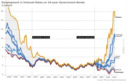
Ezra Klein surveyed 18 economists for their charts of the year. Here’s my candidate, courtesy of Spiegel Online:

This chart illustrates the end of euro complacency. Investors once acted as though the euro eliminated not just currency risk but sovereign credit risk. All nations–from Greece to Germany–could borrow at the same low rates. No longer. As the financial crisis enters its fifth year, markets are again distinguishing between strong nations and weak.

I subsequently discovered that I am not alone in choosing this chart. The BBC has a version of this as the first entry in its survey of top graphs of the year (with commentary by Vicky Pryce of FTI Consulting), and Desmond Lachman of the American Enterprise Institute included it in Derek Thompson’s survey of top graphs over at the Atlantic.

P.S. For the United States, I think Brad DeLong is right: behold the shortfall in nominal U.S. GDP.

North Korea’s Economic Failure in a Second Picture

North Korea isn’t just dark. If you look at the nation’s per capita income, it’s clear that the economic situation has gotten darker.

Over at the Washington Post Wonkblog, Brad Plumer crunches the data on per capita income in South and North Korea since the 1970s. Stunning divergence:

Note that Kim Jong Il took power in 1994.

P.S. Data about North Korea’s economy are, of course, spotty and incomplete. That’s why the line for North Korea is so flat; in many years, reported GDP per capita doesn’t change. So take the specifics with a grain of salt. But the overall picture remains the same.

North Korea’s Economic Failure in One Picture

North Korea is notoriously secretive. But it can’t hide from satellites. Here are nighttime images showing the amount of light coming from the Korean peninsula.

As Donald Rumsfeld once said, “North Korea is dark”:

This image comes from “Measuring Economic Growth from Outer Space” by J. Vernon Henderson, Adam Storeygard, and David N. Weil, who demonstrate how light can be used as a proxy for measuring economic growth in places with poor economic data.

For other versions of this image, just google north south korea at night.

Will New Technology Help People Escape the “Sports Tax”?

Today’s exercise in everyday economics: Brian Stelter and Amy Chozick making the case that cable and satellite TV subscribers are paying a “sports tax”  (ht: Jennifer R.). Writing in the New York Times, they say:

Although “sports” never shows up as a line item on a cable or satellite bill, American television subscribers pay, on average, about $100 a year for sports programming — no matter how many games they watch. …

Publicly expressing the private sentiments of others, Greg Maffei, the chief executive of Liberty Media, recently called the monthly cost of the media empire ESPN a “tax on every American household.”

Patrick Flynn personifies the consumer challenge. He and his wife, who pay Comcast $170 a month for television, Internet and a home phone in Beaverton, Ore., are keenly aware that part of their bill benefits the sports leagues that charge networks ever-increasing amounts for the TV rights to games. Save for one regional sports channel, he said, none of them are worth it. …

But there are also millions of viewers like Russell Tibbits, of Dallas, who says, “If you eliminate sports channels from cable packages, I literally would not own a TV.”

Sports channels apparently make up a sizeable chunk of subscription costs. The authors report, for example, that ESPN earns about $4.69 monthly for each subscriber, while the next closest channel is TNT at a mere $1.16.

Given the limited number of channel bundles that cable and satellite services typically provide, the relatively high cost of sports channels creates the possibility of significant cross-subsidies. The sports-agnostic end up covering some of the costs of the sports-obsessed.

Of course, the reverse can also be true. Russell Tibbits may watch only sports channels, but he’s helping pay for AMC, Lifetime, and TNT, too.

For that reason, both sports fans and non-fans may prefer more choice about which channels they pay for. This “a la carte” discussion has been around for years, but Stelter and Chozick highlight a new factor. Changing technology make it make it easier for subscribers to get around current subscription models:

Soon, though, there may be an Internet alternative — something that was heresy until recently. Distributors like Dish Network are talking to channel owners about creating virtual cable providers that would stream channels over the Internet instead of traditional cables. That would break up the bundle of channels that subscribers have grudgingly accepted for years and allow subscribers who don’t like sports to avoid paying for them.

“They’re aggressively looking for ways to offer a lower-cost package of channels without sports,” said the chief executive of one such channel owner, who insisted on anonymity because the talks were confidential. “There may be a market in America, whether it’s 10 or 20 million people, that would be very happy to have 50 or 60 channels but not ESPN.”

By streaming the channels online, old distributors like Dish or new ones like Google could do an end run around the contractual commitments and market dynamics that effectively force them to carry sports channels now.

Why Are Restaurant Dinners Pricier Than Lunch?

Over at Quora, restaurateur Jonas M. Luster explains why he charges more for items at dinner than at lunch:

  • Lunch isn’t prepared and served by my A-team. Many times waiters and cooks have to prove themselves during lunch before being allowed on the dinner line. This means I pay less in payroll.
  • Lunch doesn’t usually serve a full menu. The menu is optimized for faster production and oftentimes smaller portioned. Smaller menu means less storage, smaller dishes mean less storage, and faster turnaround means less secondary storage costs (hot/warm holding, etc.)
  • Lunch diners spend an average of 45 minutes from entry to exit, dinner guests take over twice as long. This means faster turnaround during lunch hours, which either means more covers or less staff needed. Both saves me money.
  • Lunch guests don’t want/need candles and expensive bottles of water. They want food. We cater to this by dropping down to the bare bone of fine dining hospitality, removing fluff.

Last, but not least, lunch is a competitive market. We compete with in-house cafeterias, the dirty water hot dog cart, chain restaurants, and delivery businesses.

More answers here.

A Great Introduction to Economic Inequality

Over at the Browser, Sophie Roell interviews MIT economist Daron Acemoglu on the economics of inequality. In the course of discussing five books on the topic (one of which is actually a research paper), Acemoglu hits many of the high points — technology, skills, and education; the increase in income at the tippy-top of the wage distribution in the United States (and elsewhere); and the importance of politics, power, and rent-seeking.

Well worth your time.