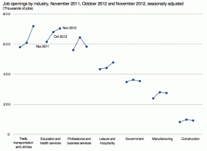
Over at The Why Axis, Jon Schwabish has a great show-and-tell on improving economic visuals in Excel. He starts with a chart of job openings data from the Bureau of Labor Statistics that was clearly made using Excel’s default settings (click charts to enlarge):
Jon demonstrates many improvements. I particularly like this one:
To my eye, this chart is way better than the original, although it shares one big flaw: the horizontal spacing of the dots doesn’t match the timing. Jon then corrects that and adds more information (I might have stopped with just getting the spacing right):
Check out his original post for an easy guide to the how and why of these changes and a copy of his Excel file.
For all the talk of red states and blue states, much of America is really purple.
That simple observation has inspired some great alternatives to the standard red and blue maps depicting electoral outcomes.
Princeton’s Robert Vanderbei, for example, has created an animation that makes three improvements on the standard red/blue map: he maps counties not just states; he uses shades of purple to reflect the mix of Democratic and Republican votes; and he uses green for third parties.
Here’s his animation for the 1960 to 2008 elections; keep an eye out for Ross Perot. (Vanderbei also has a static version of the 2012 results.)
Michigan’s Mark Newman also adopts the purple view, with another wrinkle. Traditional maps emphasize geographic area, not the location of electoral votes (or population). Using some fancy math, he resizes and reshapes states to reflect their relative electoral import. The result resembles a smooshed butterfly, with blue areas (mostly cities) amid a red web:
High frequency trading (HFT) has taken off like wildfire in recent years. Nowhere is that better illustrated than in this stunning animated GIF from Nanex, a provider of streaming market data (ht: Felix Salmon).
The gif shows the rise in HFT or algorithmic trading from 2007 through early 2012. It doesn’t capture last week’s meltdown at Knight Capital, but you can see many other seminal events of recent years.
I find it strangely beautiful, like watching a fire build.
Michael Cembalest, head of investment strategy at JP Morgan, is famous for his beautiful, insightful charts. His latest (courtesy of Paul Kedrosky) illustrates two millennia of world economic history:
According to the chart, India (orange) and China (red) together comprised more than two-thirds of the globe’s economic activity back in year 1 (well, not so much the globe, but the chosen countries). By 1950, their share had fallen to only one-eighth, thanks to the growth of the United States (green), Western Europe (shades of blue), Russia (gray), and Japan (yellow). Since then, China has been gaining share.
Not surprisingly, the chart has already attracted attention in the blogosphere. Over at the Atlantic, Derek Thompson slices and dices the data to see how much of the pattern reflects the ebbs and flows of population vs. productivity.
At the Economist, meanwhile, K.N.C. channels Edward Tufte, expressing appropriate alarm about the compressed x-axis. The first millennium gets as much real estate as the 1990s. K.N.C. then offers another approach:
Given data limitations, this chart also compresses the x-axis, but using bars and variable-width gaps make it much clearer that there are jumps between years. The focus on a limited number of countries also makes it clear that the chart omits countries that account for 30-40% of world GDP. In Cembalest’s chart, in contrast, one wonders what happened to South America, the Nordic countries, Canada, Africa ex Egypt, etc. His listed countries appear to sum to 100% of world GDP, but large swathes of the world are unaccounted for.
My Sunday reading turned up three examples of glaring numeracy errors. I make plenty of my own errors, so I have sympathy for the perpetrators. But I did want to highlight them as examples of what can happen when quantitative thinking runs off the rails. And the need to remain mathematically vigilant in your daily life.
So please take this short numeracy quiz. My answers after the fold.
1. How much has teen drinking declined?
In today’s New York Times Magazine, Tara Parker-Pope makes the case that teenagers are more conservative than their parents were. For example, the fraction of high-school seniors who reported that they had recently consumed alcohol fell from 72% in 1980 to 40% in 2011.
I have no beef with those statistics (or that trend), but I do wonder about the chart used to illustrate it. Do you see anything wrong in this visual?
2. What’s a fair way for students to hedge their bets on today’s Super Bowl?
A few pages later (in the ink-and-paper edition), the NYT’s Ethicist, Ariel Kaminer receives a letter from a parent whose child was offered a bet on the Super Bowl … by their school. Leaving aside the propriety of book-making in the class room, what do you think of this wager?
My school charged a dollar for students to bet, or “predict,” which team would win the Super Bowl. It was $1 for one team, and if you won, you would get a candy bar. If you bet $3, you could choose both teams and guarantee your candy bar. Is this legal or even morally right?
3. How much does federal compensation exceed private compensation?
In Friday’s Wall Street Journal, finally, Steve Moore makes the case that federal workers are overpaid. What’s wrong in the following excerpt? (ht: Brad DeLong)
Federal workers on balance still receive much better benefits and pay packages than comparable private sector workers, the Congressional Budget Office reports. The report says that on average the compensation paid to federal workers is nearly 50% higher than in the private sector, though even that figure understates the premium paid to federal bureaucrats.
CBO found that federal salaries were slightly higher (2%) on average, while benefits — including health insurance, retirement and paid vacation — are much more generous (48% higher) than what same-skilled private sector workers get.
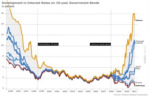
Ezra Klein surveyed 18 economists for their charts of the year. Here’s my candidate, courtesy of Spiegel Online:
This chart illustrates the end of euro complacency. Investors once acted as though the euro eliminated not just currency risk but sovereign credit risk. All nations–from Greece to Germany–could borrow at the same low rates. No longer. As the financial crisis enters its fifth year, markets are again distinguishing between strong nations and weak.
I subsequently discovered that I am not alone in choosing this chart. The BBC has a version of this as the first entry in its survey of top graphs of the year (with commentary by Vicky Pryce of FTI Consulting), and Desmond Lachman of the American Enterprise Institute included it in Derek Thompson’s survey of top graphs over at the Atlantic.
The Wall Street Journal has a lovely graphic this morning illustrating the strengths and weaknesses of U.S. economic recoveries since World War II.
No surprise, the current recovery is long on weaknesses and short on strengths:
The graphic is based on a very similar one the IMF included in its recent overview of the U.S. economy (officially known as the 2011 Article IV Consultation). I’ve pasted the original IMF graphic below.
Are you smarter than Honest Tea, the upstart purveyor of natural (and yummy) teas? To see, please compare the sizes of the yellow and black coffee cups:
How big do you think the yellow cup is relative to the black one?
You must be logged in to post a comment.