The most encouraging item in todays jobs report was the sharp drop in underemployment (which includes not only those who are unemployed but also marginally attached workers and those who are part time for economic reasons). The underemployment rate fell to 16.5%, down from its peak of 17.4% last October and from 17.3% in December:
The headline unemployment rate also declined; it now stands at 9.7%, down from its 10.1% peak in October and from 10.0% in December.
These declines are encouraging, but the labor market obviously has a long way to go. Just how far was reinforced by BLS’s updated figures on the number of payroll jobs. Total job losses now stand at 8.4 million since the recession began at the end of 2007.
The economy grew briskly last quarter. According to the advance estimate by the Bureau of Economic Analysis, gross domestic product increased at a 5.7% pace in the fourth quarter of 2009, faster than many forecasters had expected. (Note: BEA will revise this figure next month and the month after that. Oh, and then BEA will revise it periodically over the next few years.)
As usual, I think the best way to understand this report is to see what sectors contributed the most or least to reported growth:
As expected, much of the growth reflects businesses restocking their shelves and warehouses: inventories accounted for 3.4 percentage points of the overall 5.7% of growth.
Consumer spending grew at a moderate 2.0% pace and thus added 1.4 percentage points to overall growth (consumer spending accounts for about 70% of the economy and 70% x 2.0% = 1.4 %). That’s down from the previous quarter, when cash-for-clunkers boosted car purchases. Housing investment also slowed, again in the wake of earlier efforts–the tax credit for new home buyers–that had boosted growth in the third quarter.
Business investment in equipment and software showed signs of life, growing at a 13% pace, the strongest since early 2006. That added 0.8 percentage points to growth, slightly more than half of which was offset by the ongoing decline in business investment in structures.
Government spending fell slightly during the quarter. Stimulus efforts boosted non-defense spending by the federal government, but that increase was more than offset by a decline in defense spending and a small decline in state and local spending.
(This is a slightly edited version of a piece that appeared yesterday over at e21.)
As policymakers ponder whether and how they might be able to do more to encourage job creation, they should keep in mind that the monthly payroll job figures [e.g., -85,000 in December] are the net result of literally millions of hiring and firing decisions each month. In addition to the well-known payroll data, the Bureau of Labor Statistics also provides information about the monthly pace of hiring, firing, etc. Those data, known as the Job Openings and Labor Turnover Survey or JOLTS, allow us to track the overall dynamism of U.S. labor markets and the relative balance of gross job gains and losses.
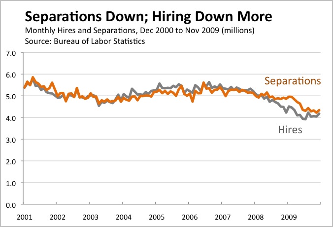
As shown in the following chart, the total number of new hires each month tracks fairly closely over time with the number of people who separate (either voluntarily or involuntarily) from their jobs:
As you would expect, new hires were higher than separations in the middle of the decade when employment was growing. Since the start of the recession, however, separations have outstripped hires by a wide margin.
As the chart shows, overall labor market activity has plummeted over the past two years. New hiring has fallen by more than 1 million workers per month. Employers hired more than 5 million new workers each month back in 2007, but have recently been hiring only slightly more than 4 million. Separations show a similar pattern, as about 1 million fewer workers are leaving their jobs each month than did before the recession.
The decline in separations may seem surprising at first, but is easily understood when separations are divided into layoffs and discharges (i.e., involuntary separations) and quits (i.e., voluntary separations):
As you would expect, layoffs and discharges increased sharply during the recession. During the depths of the financial crisis in late 2008 and early 2009, an average of more than 2.5 million workers lost their jobs each month. The pace of layoffs has since slowed—about 2.1 million workers lost their jobs in November—but remains above levels consistent with growing employment.
Quits, meanwhile, have fallen off a cliff. An average of 1.8 million workers left their jobs voluntarily each month during 2009, about 40 percent lower than the 3.0 million pace a few years ago. In short, many fewer workers are finding opportunities to move to better jobs.
The JOLTS data suggest that the pace of quits may be one of the best signs of a healthy labor market. The uptick in November—to the highest level in ten months—is thus welcome and something to keep an eye on in coming months.
The positives are fewer, so let’s start with them:
With job losses of 85,000, December was the second-best (or, if you prefer, second-least-bad) month since January 2008.
With today’s revisions, November actually showed job gains of 4,000, the first increase since December 2007.
Put that all together, and job losses averaged 69,000 per month in the last quarter of 2009. That’s unwelcome, but much better than the average of 691,000 jobs lost in each of the first three months of the year.
Employment in temporary help services–often viewed as a leading economic indicator–increased by 46,500 in December.
And here are the negatives:
December’s job losses were much larger than most forecasters had predicted.
The upward revision to November job growth happened only because October jobs were revised down, making November look better. The actual level of November jobs was also revised down (by 1,000).
Although the unemployment rate was steady at 10.0%, the details beneath that figure were horrible. Household-reported employment fell by 589,000; the only reason that the unemployment rate stayed constant is that even more people–661,000–dropped out of the labor force.
The labor force participation rate thus fell to 64.6% and the employment-to-population ratio fell to 58.2%, the lowest since 1985 and 1983, respectively.
The underemployment rate (U-6) increased to 17.3%.
Bottom line: The economy is growing (as suggested by other data), but that growth is not yet translating into new jobs.
As expected, the Bureau of Economic Analysis revised down its estimate of Q3 GDP growth. BEA’s second estimate pegs growth at a 2.8% annual pace in Q3, down from 3.5% in the advance estimate.
The revision was driven by three main factors: consumer spending and business investment in structures were weaker than previously estimated, while imports were stronger.
As usual, I think a useful way to summarize the drivers of Q3 growth is to look at the contributions:
In principle, the solid growth in consumer spending and housing investment should be promising signs, given their previous weakness. However, both were boosted by temporary stimulus efforts. Cash-for-clunkers lifted consumer auto sales in Q3, for example, but we should expect some payback in Q4. Meanwhile, the tax credit for new home buyers helped housing investment record its first increase since late 2005, but some of that may have come at the expense of future housing investment (because potential home owners accelerated purchases when they thought the credit was going to expire; it’s since been extended and broadened).
Note: If the idea of contributions to GDP growth is new to you, here’s a quick primer on how to understand these figures. Consumer spending makes up about 70% of the economy. Consumer spending rose at a 2.9% pace in the third quarter. Putting those figures together, we say that consumer spending contributed about 2.1 percentage points (70% x 2.9%, allowing for some rounding) to third quarter growth.
Nationwide, unemployment has averaged 8.6% over the past twelve months, but that average conceals enormous variation.
At one extreme, unemployment has averaged just 3.6% for white women age 25 to 44 who have a college degree.
At the other extreme, unemployment has averaged 48.5% for black men age 15 to 24 who don’t have a high school degree.
(The NYT uses a twelve-month average in order to smooth out statistical noise in the estimates of unemployment for narrower demographic groupings. By way of comparison, note that the national unemployment rate was 10.2% in October, much higher than the twelve-month average of 8.6%.)
Consumer spending grew at a 3.4% pace, the fastest since the first quarter of 2007. A substantial fraction of that growth reflects vehicle purchases, which were temporarily boosted by the cash-for-clunkers program.
Residential investment grew for the first time since late 2005, driven in part by the tax credit for new homebuyers.
Imports rose for the first time in two years. Most of that increase came from goods, which is consistent with the idea that auto imports increased in response to cash-for-clunkers.
You may notice a trend here, as government policies had a significant effect on the pattern of growth in the third quarter.
As I’ve mentioned before, I think one of the best ways to understand the pattern of growth is to look at the contributions that each major sector made to the overall growth rate:
As you can see, consumers, inventories, and exports were the main drivers of Q3 growth, while imports were the main drag.
Q3 represents a striking change from Q2 (shown in the next chart), when the economy contracted at a 0.7% pace and private spending was weak across the board:
Note: If the idea of contributions to GDP growth is new to you, here’s a quick primer on how to understand these figures. Consumer spending makes up about 70% of the economy. Consumer spending rose at a 3.4% pace in the third quarter. Putting those figures together, we say that consumer spending contributed about 2.4 percentage points (70% x 3.4%, allowing for some rounding) to third quarter growth.
Earlier today, the Federal Reserve released its latest data on industrial production. Bottom line: production over the past three months has been surprisingly strong. Growth in September was more than expected, and the previous month was revised upward.
Industrial production has now increased for three straight months, as has a slightly narrower measure, manufacturing production:
As you can see, manufacturing production turned consistently negative in January of 2008 and then fell off a cliff toward the end of the year. After declining in 17 of 18 months (driving manufacturing production down a total of 17%), manufacturing production has now risen for three straight months (for a cumulative rebound of about 3%).
Manufacturing still has a long way to go. But the recent strength in industrial production, generally, and manufacturing, specifically, adds weight to the view that the recession may have ended early this summer. (Recall that the last recession ended in November 2001, even though job losses continued long afterward.)
Kudos to Floyd Norris over at the New York Times for characterizing total job losses to date as 8 million jobs, not “just” 7.2 million. As I discussed on Friday, the Bureau of Labor Statistics estimates that the number of jobs in March 2009 was 824,000 lower than it previously thought. But BLS won’t include this adjustment in its official data until early February.
The official, as-yet-unadjusted data indicate that 7.2 million jobs have been lost since the recession started in December 2007. The future revision to March figures, however, implies that a better estimate would be 8 million.
We can now expect several months in which commentators use different figures for total job losses. Those steeped in the details, like Norris, will use the 8 million figure. Those less-attuned to the details, like the authors of the NYT’s lead editorial (just four pages after Norris’s article), will use the 7.2 million figure.
Norris also addresses the obvious question: Why did BLS miss the March level of jobs by such a large amount? The answer is that BLS has to estimate jobs gained and lost at certain employers, and their model is not doing as well as we (or it) would hope:
The official job numbers are based on a monthly survey of employers, augmented by something called the “birth-death model,” which factors in jobs assumed to have been created by employers who are too new to have been included in the survey, and subtracts jobs from employers assumed to have failed and therefore not responded to the latest survey.
Victoria Battista, an economist at the Bureau of Labor Statistics, said the bureau was looking at whether that model needed to be changed, as well as at other possible issues, such as changing response rates to the questionnaire sent out to employers each month.
The newest revision is called a “benchmark revision.” Such revisions are disclosed each October, and led to reductions in job totals in both 2007 and 2008. But the changes those years were tiny when compared with the changes this year.
For the 12 months through last March, the birth-death model added 717,000 jobs to what the bureau would have reported had it relied solely on its survey.
While the government uses the survey of employers to estimate the number of jobs, the benchmark revisions are based on reports from states on the number of employees for whom unemployment insurance premiums are paid. Those numbers take longer to be available, but are considered to be more reliable.
For example, the following chart illustrates how the earnings of men and women (age 25-54) have changed at different points in the earnings distribution:
The chart confirms two well-known findings: men, on average, earn more than women, and high-earners have seen the largest earnings gains in recent decades. Other takeaways include:
In real terms (i.e., adjusting for inflation), men at the 10th and 50th percentiles (of the male earnings distribution) in 2007 earned about the same as similarly situated men back in 1979.
Women’s earnings have been growing faster than men’s. Women at the 10th and 50th percentile (of the female earnings distribution), for example, had higher earnings in 2007 than their counterparts in 1979.
Women at the 90th percentile in 1979 earned a bit less than the median man. In 2007, however, a woman at the 90th percentile earned 66% more than the median man.
The following chart illustrates how earnings have evolved among the top 10% of men and the top 10% of women from 1989 to 2007:


")
")


