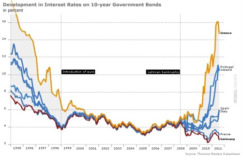
Ezra Klein surveyed 18 economists for their charts of the year. Here’s my candidate, courtesy of Spiegel Online:
This chart illustrates the end of euro complacency. Investors once acted as though the euro eliminated not just currency risk but sovereign credit risk. All nations–from Greece to Germany–could borrow at the same low rates. No longer. As the financial crisis enters its fifth year, markets are again distinguishing between strong nations and weak.
I subsequently discovered that I am not alone in choosing this chart. The BBC has a version of this as the first entry in its survey of top graphs of the year (with commentary by Vicky Pryce of FTI Consulting), and Desmond Lachman of the American Enterprise Institute included it in Derek Thompson’s survey of top graphs over at the Atlantic.
P.S. For the United States, I think Brad DeLong is right: behold the shortfall in nominal U.S. GDP.

This seems like a pretty misleading chart to me. The pre Euro interest rates a probably not real but nominal rates, meaning that Greece probably had a lot of inflation. The recent increase in interest rates is pretty much all real. Am I missing something here? If not, why is this graph particularly interesting or novel? Everyone knows how interest rates have gone up over the last few years.
Quatre jours plus tard, il a écrit qu’il avait eu une ?semaine terrible” mais a dit “amis ont été formidables?, ajoutant: ?Maintenant j’ai une certaine fa?on me ressaisir”.